
The Problem
Glasgow is home to three Scottish universities: Glasgow University, Strathclyde University (, and Glasgow Caledonian University. As a result, it should come as no surprise that the number of new university students in Glasgow alone each year exceeds 50,000. Many of those students will come from all over Scotland, the United Kingdom, and the world, and they may find themselves in a strange place with little or no knowledge of what Glasgow has to offer in terms of entertainment, clubs, bars, restaurants, sporting activities, or places for students to socialise.
Client requirement
Glasgow City Council has requested the development of a new mobile application to promote student life in Glasgow.
Challenge
The challenge was to research and create an engaging and useful mobile app for Glasgow City Council to help new students discover what the city has to offer. The app could drive traffic to tourist attractions, restaurants, bars, clubs, sporting venues, and so on, as well as build trust as a credible guide and a reliable source of good information, promotions, deals for students, and services for students aged 18–24. The goal was to design a Student Guide that gives new students a positive experience of Glasgow while introducing relevant new patterns and trends identified through research and considering potential user accessibility needs and requirements.
Timeline
September 2023 - December 2023
Tools
Figma, Miro, Adobe Photoshop, Canva, Adobe After effects
My Role
Research and design from concept
to completion
Links
40% Faster Task Completion
35% Reduction in Navigation Errors
25% Increase in User Satisfaction
The outcome
The Float mobile app redesign resulted in a more intuitive, user-focused experience that addressed key pain points identified during research. By streamlining navigation, improving visual hierarchy, and focusing on user goals, the final design enhanced both usability and task efficiency. User testing confirmed that the new interface reduced confusion and improved user satisfaction. The solution also laid a strong foundation for scalable feature additions in future releases.
Don't just take my word for it

Helen Buchanan
Programme Leader of Digital Design at Glasgow Caledonian University
I have had the privilege of working with many talented students over the years—but few have stood out as much as Ru. During their time on the UXID Programme at Glasgow Caledonian University, Rhu consistently demonstrated a level of curiosity, discipline, and creativity beyond their peers.
It was clear that Ru had a natural instinct for user-centred design. Their work was always grounded in research and empathy, and they had a remarkable ability to turn complex problems into intuitive, visually compelling solutions. Ru approached every project with professionalism and a genuine desire to learn and grow.
In addition to excelling as a student, Ru has also taken on the role of teaching assistant, where she absolutely thrives. She has an ability to explain complex design concepts clearly and patiently. Students regularly praised her for her guidance, support, and encouragement. Her leadership and mentoring contributed meaningfully to the learning environment, and she quickly became a trusted resource for both her peers and faculty.
Ru is one of the most hardworking and multi-talented designers I have worked with. She brings a combination of visual design strength, UX thinking, prototyping skills, and strategic insight to everything she does. Whether working independently or as part of a team, she always delivers high-quality results with creativity, consistency, and care.
I have no doubt that Ru will bring immense value to any organization. She is not only a gifted designer, but also a natural collaborator, mentor, and leader. Any team would be lucky to have her."
Design Process
This project will use the Double Diamond design process and will be divided into four stages: Discover, Define, Develop, and Deliver.
I began the project with the ‘discover’ phase, where I researched the clients, competitors, and users. The insights gained guided me to the ‘define’ phase, where I identified the problem and outlined a potential solution. Next, in the ‘develop’ phase, I explored and tested various ideas through multiple iterations. Finally, I reached the ‘deliver’ phase, where I created a high-fidelity prototype.


Discover
Understand the Client
Glasgow City Council is the client for this project, so I explored their website to understand their values, vision, and mission. I also reviewed their annual report to see how they currently promote student life in Glasgow and their future plans. To better define the project requirements, I conducted a SWOT analysis to identify key strengths, weaknesses, opportunities, and threats.
.jpg)
Understand the Demography
The brief specified that the target audience for this application was students aged 18–24. To ensure a user-centred design, I needed to fully understand this age group and how the app could be tailored to their needs. By researching journals, articles, and conducting surveys, I gained deeper insights into this demographic.
This group, commonly known as Gen Z, has grown up in the digital age and is highly familiar with technology and digital devices.

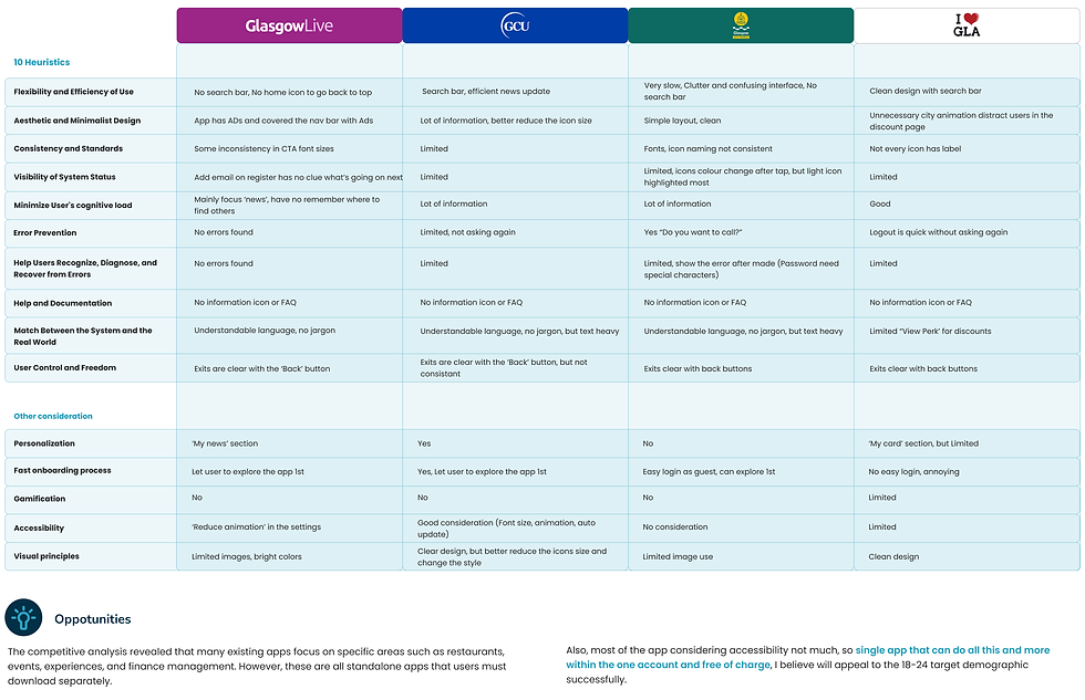
Competitor Analysis
Conducted competitive and comparative product and service research, as well as heuristics to identify innovation, pain points, trends, and patterns. To gain insight, plan and execute user tests on at least two of these competitors with two or more users. I have concentrated on the user experience and highlighted any points of pain or delight for the user.
.png)

Competitor Summary
.png)
Define
Empathy Mapping and Building Persons
After gathering insights from demographic research, I interviewed five participants aged 18–24. Using the data from these interviews and research, I created an empathy map to understand better how the target audience thinks, feels, and behaves.
To design a solution that meets their needs and addresses their frustrations, I also developed user personas. Experts recommend creating two primary personas, so I used affinity diagrams and empathy maps to organise the research findings. From this, I created two personas, each with a user journey scenario.
.jpg)


Problem Statement
Based on users' needs, goals, and pain points, I created POV (Point of View) statements. These statements provided insight into who the users are and helped tell their story. This understanding was crucial in identifying the right problem to solve and making informed design decisions. It also helped set clear criteria for evaluating ideas.

How Might We (HMW) Statement
By defining user problem statements, I was able to create "How might we" insights based on the POV questions. This helped me reframe my findings into opportunities and develop innovative solutions to address the user challenges identified during research and captured in the user personas.

Kano and MoSCoW Model
Based on the POV statements and HMW solutions, the Kano model was created to gain a deeper understanding of user needs and their relevance. The MoSCoW method was used to prioritise features effectively.
.png)
.png)
Develop
Crazy 8's Sketches
After finalising the features and creating the design brief, I began brainstorming using the Crazy 8s technique.
For each screen, I quickly sketched eight ideas in eight minutes to encourage fast thinking without getting attached to a single idea. I then combined the most meaningful and effective elements from these sketches to form a refined concept.
.png)
Links: Sketches
Information Architecture and User Flow
When sketching, I realised the importance of app architecture. Without a rough structure, I was wasting time designing individual screens without a clear flow. So, after using Crazy 8s for the main app frames, I created an information architecture to guide the design process. This structure was continuously improved based on user testing. Below is the first version.
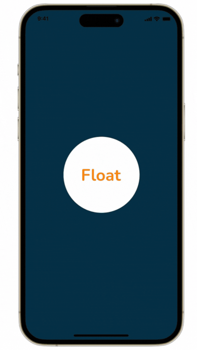
Users are first greeted by a splash screen and an onboarding process that highlights personalized app features before signing up and reaching the home screen.
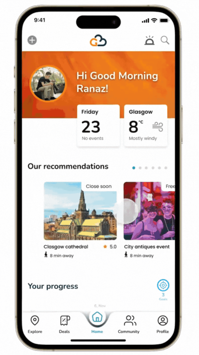
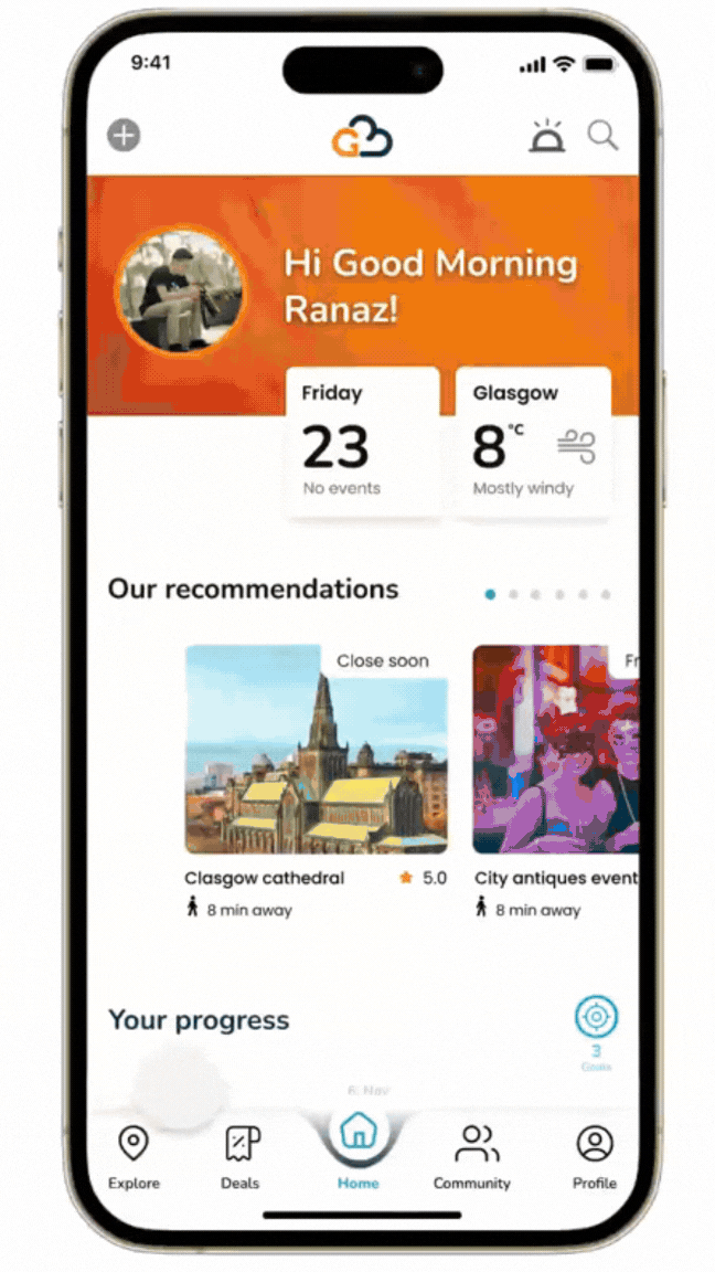
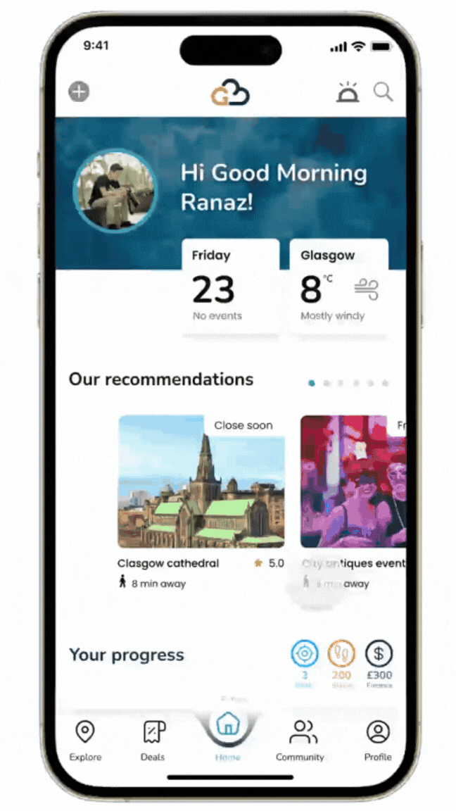
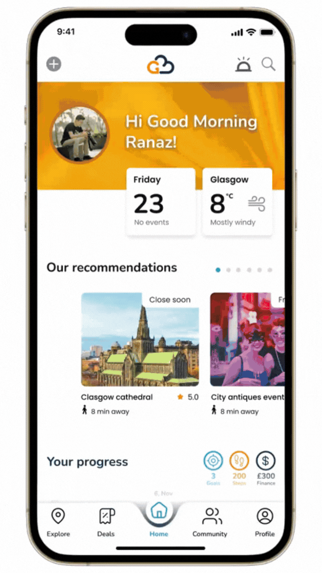
In the final version, the menu bar includes five key sections:
-
Home – Main dashboard
-
Explore – Discover new places and events
-
Deals – Special offers for students
-
Community – Used for personalisation and gamification
-
Profile – Includes personal settings and accessibility options
The settings screen contains app preferences, including accessibility features like colorblind color selections, dark/light mode changes,s and font size adjustments.
.png)
Links: Information Architecture
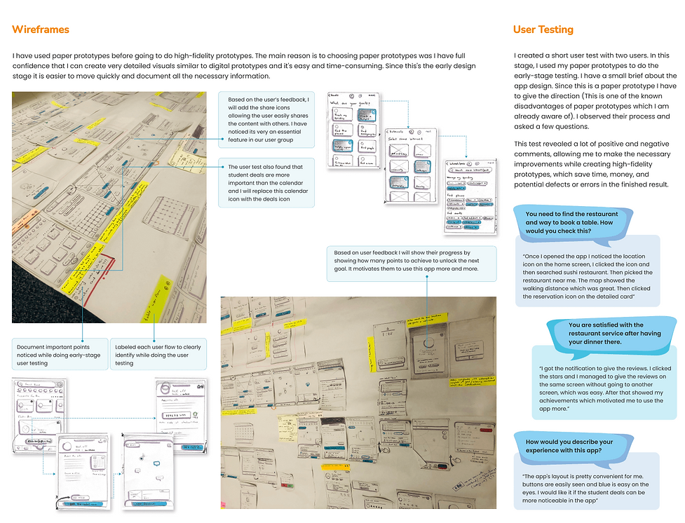
Wireframes and User Testing
Using refined ideas from crazy 8s, I created high-fidelity sketches, which I later turned into wireframes.
I conducted a short user test with two participants using paper prototypes for early-stage testing. Before starting, I provided a brief overview of the app design. Since this was a paper prototype, I had to guide the users through the process (a known limitation of this method).
During the test, I observed their interactions and asked a few questions. The feedback included both positive and negative comments, which helped me identify areas for improvement. These insights were used to refine the design before moving to high-fidelity prototypes, ultimately saving time, money, and potential errors in the final product.
.png)
Key Modifications
I recorded the insights from the tests and used affinity diagrams to organise them by priority, based on their impact on the user flow. I then made adjustments accordingly. Here are some of the key modifications:
.png)
Style Title
Before designing the high-fidelity screens and prototype, I created a style guide to establish and enforce design guidelines, ensuring consistency and providing a cohesive visual language for the application.
Why choose the following colors?
In app design, blue typically signifies trust, reliability, stability, and calmness, making it a great choice for an app targeting international students who move to a different country alone and need a sense of trust. Orange conveys positivity and energy, which can encourage engagement and daily app usage by international students. Yellow is attention-grabbing, making it useful for highlighting important information or guiding users through key actions.
A combination of these colors can create a visually appealing and functional design that enhances user experience.
Why Choose Rounded Buttons?
Rounded buttons are believed to reduce misclicks because they provide a larger and more forgiving target for users to interact with. When a button has sharp corners or edges, it can be harder for users to accurately click on the exact point they intend to.
Why choose Poppins and Nunito fonts?
Poppins and Nunito were chosen for their readability, modern aesthetic, and versatility. Poppins provides a bold, geometric look for headings, while Nunito’s rounded edges enhance readability for body text. Together, they create a visually appealing, accessible, and consistent design across different screens and platforms.
.png)
Mid-fi Prototype and User Testing
After creating the mid-fi version, I conducted user testing with four participants, all aged 18–24 and international students from Sri Lanka, India, and Egypt.
During the test, I observed their interactions and asked a few questions. The feedback included both positive and negative comments, which helped me identify areas for improvement. These insights were used to refine the design before moving to high-fidelity prototypes, ultimately saving time, money, and potential errors in the final product.

Links: User Testing
Key Modifications
I recorded the insights from the tests and used affinity diagrams to organise them by priority, based on their impact on the user flow. I then made adjustments accordingly. Here are some of the key modifications:
.png)
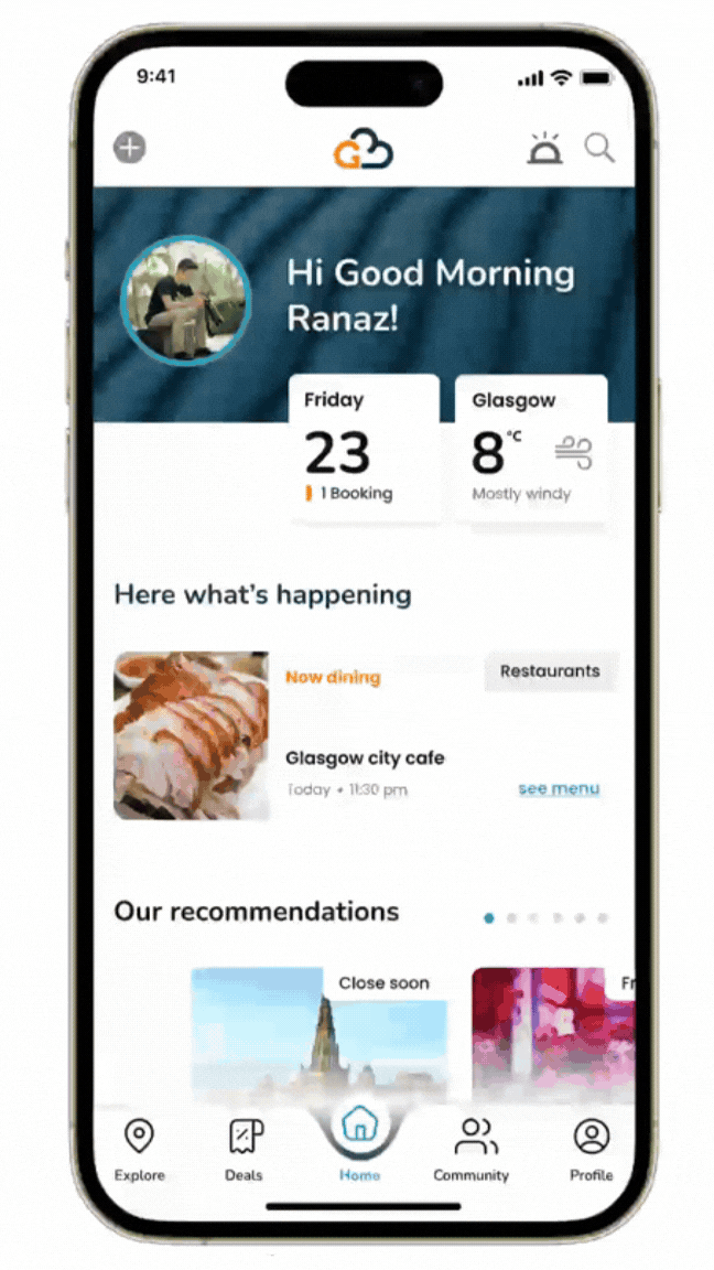
Deliver
I always enjoy the process, but seeing the project come together in a meaningful way is truly satisfying. It highlights how each step contributes to a solution. Below are some screens from the final deliverable
Onboarding Screens and Sign Up
.png)
The onboarding screen features a logo animation to welcome users to the app. It offers quick login options via Gmail or Instagram for a seamless experience. Users who already have an account can reset their password if needed. Additionally, a "What are your goals?" section helps personalize the experience, while a "Skip" option allows users to explore the app without selecting goals.
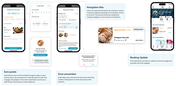
Restaurant Table Booking
Float allows users to book a table through an app. They can change the details easily and can find all the booking information once they have completed the reservation. Users can either update their reservation or cancel that.
.png)
Find Location and Map Interaction
Float allows users to book a table through an app. They can change the details easily and can find all the booking information once they have completed the reservation. Users can either update their reservation or cancel that.

%201.png)
Accessibility
.png)
I primarily followed WCAG guidelines along with W3C standards to ensure accessibility. One of my personas is color-blind, so the app is designed to be color-blind-friendly. Another persona prefers dark mode, so the app supports both light and dark modes, which users can switch in the settings. Additionally, error messages are not solely indicated by red text—icons are also included to assist color-blind users and support individuals with dyslexia.
Find and Use the Deals
.png)
User interests are different, some like to do online shopping and some prefer to go to stores. Float allow both users to find discounts in a convenient way
Gamification
The application's unique selling point is gamification, designed to keep users engaged and make the experience enjoyable. Users earn points for every action they take, such as booking a table, walking, engaging with others, or leaving reviews. This system not only motivates users but also encourages habitual interaction. Float leverages this gamification technique to create a sense of achievement and friendly competition. A leaderboard, planned for future development, will be available in the profile section to further enhance user motivation.
.png)
Links: Figma Prototype