
Overview
PARC is a physical activity and recreation center based in Sri Lanka that was established in 2019. Training sessions are conducted outside at PARC. Starting with the logo, color palette, and typography and then the branding efforts gradually spread to the whole team, with each designer focusing on his/her area of specialty.
I was honored to be in charge of the design of their promotional banners and Instagram and Facebook ads in the beginning.
Logo
The PARC logo is made up of one integrated component. This represents a typographic mark with an integrated symbol, in this case, the customized “A” letterforms. These components are always placed in a fixed relationship and must not be altered or modified in any way.
Tagline lockups
The ideal use of the PARC logo is by itself, but there are instances where the logo will require further explanation. In this case, use the tagline “Physical Activity and Recreation Center” in the following lockups. Similar to the logo components, these should not be changed or adjusted in any way.


Clear space
To ensure that this logo is highly visible wherever it’s used, it must be surrounded on all sides by adequate clear space. This space is equal in size to the height of the typography, as shown on the right side denoted by the letter X. This proportion scales according to the logo size itself, allowing for adequate clear space.

Color palette
Color theme
Black is the primary color for the logo, accompanied by a vibrant green. The balance of these 2 colors with the addition of white and light grey complete the palette.
A secondary palette helps to add greater depth to web and interactive applications. This palette complements the primary brand colors (not replaces them) and provides further color variation for communication.
As a rule, Pantone colors represent the most exact matches of the brand colors and should always be a first choice. Alternatively, CMYK values can be used when Pantone is not available. For onscreen uses (presentations, email, and other digital applications), use RGB values.


Color Usage
-
Preferred colour treatment: Primary logo in white on a field of black
-
Negative usage: Gray logo on a background field of black or white OR a dark grey logo on a light grey background


Incorrect color usage
Use the PARC logo in a way that it’s displayed clearly and consistently. When using the logo in color, avoid the following mistakes.


Typography
The PARC identity consists of custom adjusted typography. However, a set of secondary typefaces is used on accompanying brand materials. I selected these typefaces to create a consistent and strong identity.
-
Body and text copy: Two bold weights of the Montserrat font, a versatile font family
-
Headlines and subheadings: Raleway font

Logo Usage
Actual usage
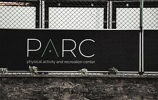
The PARC management use logo in every place such as on Instagram, Facebook, on-premises, and their promotional materials. I've created the following materials such as flyers, and promotional materials and took photo shoots for their promotions.
Social media promotion

Official Facebook page

Official Instagram page


Instagram posts
Promotional Flyers


A3 flyers - Displayed inside the premises
Other Promotional materials

Letter head
Ticket book

Ticket book - Front page design

Ticket book - Inside pages design
Photo shoot


.jpeg)


Reflections
The most important thing I learnt from this project is the importance of going above and beyond as a designer. A client may request a logo only, however, it’s the designer’s responsibility to provide a complete visual brand identity and the brand guidelines. A client may not request for the brand guidelines because they’re unaware of them. As designers, we must always strive to guide our clients along the correct path - it is only then we can feel satisfied with the job we’ve finished. Similarly, if the client is not using the logo according to the guidelines, we have to educate them about the importance of consistency to a visual brand identity.
PARC has a really good client base now. I’m looking forward to seeing where their new identity will take them!