[UX Case Study] How UX Design Quadrupled a Law Firm’s Homepage Conversions
- Ruwanthi Sulanjali
- Feb 24, 2025
- 12 min read

Updated: Jul 20, 2025
A data-driven approach using heatmaps, heuristic evaluation, and user testing to improve engagement and usability.
Intoday’s digital-first world, a well-optimized website is essential for law firms to attract and retain clients. However, having a website alone isn’t enough; ensuring users can easily navigate, engage, and take meaningful actions is crucial for success.
This is a case study I completed while working at MLT Digital (United Kingdom) as a UI/UX Designer and Front-End Developer.
Problem: A law firm* faced a significant challenge, their homepage was underperforming, particularly on mobile devices. Analytics revealed that it was the top exit page, leading to missed opportunities for client engagement.
Methods: To address this, a UX audit was conducted using heuristic evaluation and Microsoft Clarity heatmaps to identify usability issues and improve the overall user experience.
Improvements: Through data-driven design improvements, including refining the CTA strategy, optimizing the homepage layout following usability goals and design principles and guidelines, and enhancing accessibility, the results were remarkable.
Results: After implementing the above changes, the homepage saw a 400% increase in conversions, with mobile engagement nearly tripling and significant improvements in scrolling behavior and click-through rates.
This case study details the challenges faced, the research and design process, and the measurable impact of the UX enhancements.
* For ethical reasons, the real name of the client or the website will not be shared. However, the process used to achieve the results will be explained, along with how the design solutions were presented using wireframes. This way, the focus is on the method and results, not the specific client.

Overview
Industry Perspective on Heatmap Analysis
Client’s Requirement Analysis
Step 1: Understanding the Problem
Website Heuristic Evaluation
User Research: Microsoft Clarity Analysis
Step 2: Getting Client Approval and HMWs
Step 3: Iterative Design and User Testing
Results: Quadrupling Conversions
Client Feedback and Opportunities Gained
Key Takeaways
#1. Industry Perspective on Heatmap Analysis
Before discussing the process, the goal was to understand industry perspectives on heatmap analysis in problem-solving. The aim was to explore whether professionals use heatmap analysis or rely on different methods to analyze user behavior and identify real user problems.
To explore this, a 2-week survey was conducted on LinkedIn and Instagram. The results showed (Figure 2) that 20.8% of respondents hadn’t used heatmaps but wanted to try them, while 8.33% had never used them because they had other approaches.

People who use heatmaps already understand their benefits and how to implement them. This article is mainly for those who want to understand how heatmaps can help improve user experience and page performance based on user behavior analysis.
#2. Client’s Requirement Analysis
The client’s primary concern was the underperformance of their homepage, particularly on mobile devices, as indicated by Analytics data.
A six-month analysis (Figure 3) showed that most users accessed the website via mobile rather than desktop, with the homepage being the top exit page.

As a UX designer, the goal was to identify the reasons behind this issue.
There are several ways to uncover usability problems, but considering the timeline and client’s budget, a combination of heatmap analysis and heuristic evaluation was used to diagnose the problem effectively.
Since this is an existing client, prior experience working with them provided an understanding of their business and goals.
However, if this were a new client, it would be good to first conduct client research, considering their vision, mission, and goals to gain a deeper understanding before proceeding with the evaluation.
#3. Step 1: Understanding the Problem
A. Website Heuristic Evaluation
After receiving the client’s requirements, Nielsen Norman’s 10 heuristics, visual design principles, and accessibility guidelines (WCAG) 2.1 were used to evaluate the entire website and identify usability issues. A heuristic analysis was conducted to understand the problems across the site. Figure 4 shows the heuristic markup for the homepage wireframe on both PC and mobile.
If heuristic evaluation process is unfamiliar, it is a review conducted by one or more experts using a set of rules to check if a solution follows them. They assess how well it meets the rules and where it falls short. Expert or heuristic evaluations depend on the evaluator’s knowledge and experience

Summary of Common Issues Identified After Heuristic Evaluation
a. Inconsistent CTA Styles and Readability Issues:
CTA styles and font types were inconsistent.
Mobile line height issues affected readability.
b. Accessibility Concerns:
The “accessibility” text in the top navigation bar was not prominent enough.
The "Contact Us" form needed improvement; for example, placeholder text disappeared, straining users' short-term memory.

Figure 5 shows that only 0.89% of users who visited the “Contact Us” page submitted the form. Improving accessibility and usability could help increase conversions.
c. Not Following Most Heuristics:
There is no CTA above the fold, which negatively impacts conversion rates.
Errors in the form are not easy to recover from, and every tab is marked in red, even when valid information is entered.
There are no clear next steps or instructions on what users should do after landing on the page.
Users cannot understand the images without reading the text, as the images do not convey meaning on their own.
d. Lack of a Prominent “Contact Us” CTA:
Experts suggest placing the “Contact Us” CTA prominently in the top-right menu or footer section for better visibility.
e. Issues on Other Pages:
Text-heavy content with minimal visuals and infographics makes information harder to digest.
Lack of user trust due to missing clear navigation from service content pages to case studies and testimonials.
However, this heuristic evaluation explains why the homepage became the number one exit page, as shown in Figure 3.
To address these challenges, user research was conducted. Analytics tools like Microsoft Clarity heatmaps, behavior analysis, and session recordings were used to identify where users were dropping off and what they needed to complete their tasks.
B. User Research: Microsoft Clarity Analysis
After conducting a heuristic evaluation, Microsoft Clarity heatmaps, session recordings, and behavior analysis were used to identify user behavior patterns and highlight potential issues on mobile (Figure 6) and PC (Figure 7).
The results were analyzed over six months data, based on 2,320 sessions, including 1,656 new users and 664 returning users across the entire website.

[ Mobile ] 6-Month Heatmap Highlights: Scroll & Click Analysis
The search bar received more clicks (Figure 6) on mobile than on PC, making it beneficial to retain for improved usability, allowing users to navigate information more effectively.
Recommendation: A clear CTA should be included in each section, including the banner; otherwise, users may lack direction.
Only one person clicked the “Contact Us” form submit button at the bottom of the page, whereas the top “Contact Us” CTA received 8 clicks (Figure 6) and directed the user to the “Contact Us” page.
Recommendation: Apply the same CTA prominence to the PC view.
Only 50% of mobile users scrolled beyond the first three service boxes (Figure 6).
Recommendation: Improve the services section for mobile devices by reducing page length and enhancing visual appeal for better engagement.
Session recordings show users hiding pages for extended periods, indicating distractions or loss of interest.
Recommendation: Reducing page load times (Currently 56%) and providing more engaging homepage content or clear instructions could help retain users and prevent drop-offs.

[ PC ] 6-Month Heatmap Highlights: Scroll & Click Analysis
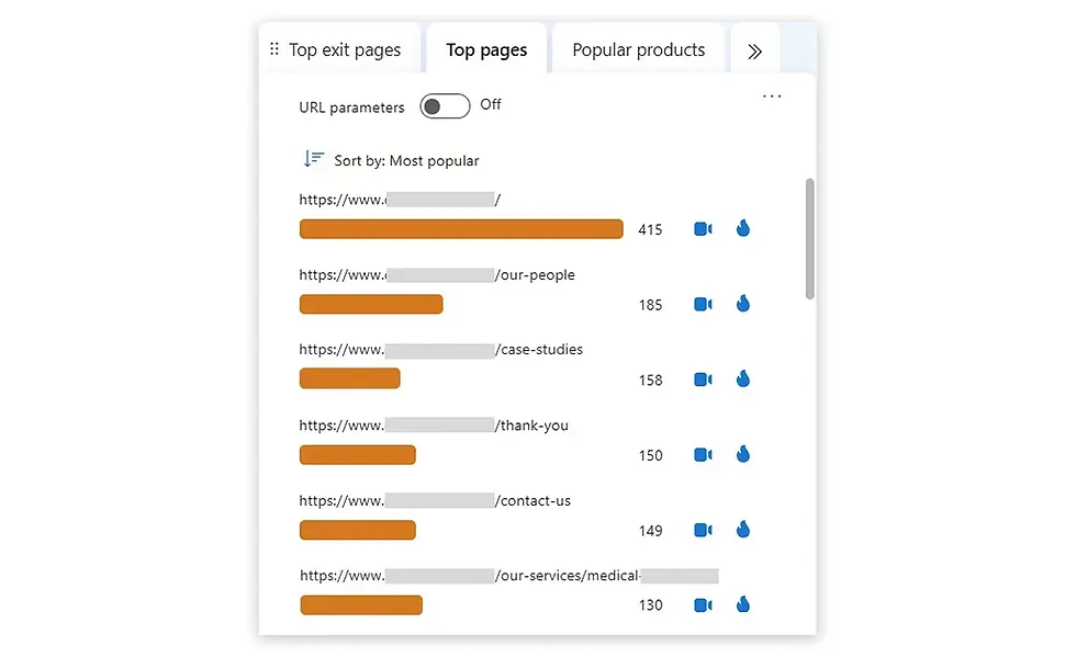
PC users frequently clicked on “OUR PEOPLE” and “CASE STUDIES” in the navigation bar (Figure 7), indicating a strong interest in learning about the team and success stories. Figure 8 of the Clarity analysis supports this finding, and session recordings confirm that a user navigated through various case studies, demonstrating engagement with the website’s content.
The behavior of new and returning users was analyzed separately. New users had more clicks on “Testimonials” and a high number of dead clicks, indicating a need to build trust and clarify information.In contrast, returning users clicked more on “Our People”, ‘’Testimonials’’ and “Case Studies,” suggesting an interest in team details and success stories.
Recommendation: A clearer user journey from the homepage is recommended to improve conversions.
The top banner received the highest number of dead clicks despite lacking a Call to Action (CTA). Session recordings also show that some users left the website shortly after arriving on the homepage, suggesting they did not find what they were looking for or lost interest quickly.
Recommendation: Implementing a primary CTA across all banners, such as “Read our Case Studies,” is advised, as research shows higher conversions for elements placed above the fold.
Scroll analysis revealed that only 15.05% of users reached the form’s submit button, with a 25% drop-off occurring after the service section.
Recommendation: As a best practice, highlighting “Contact Us” in the top navigation bar is recommended to improve accessibility.
Only 1 user clicked on the prominently displayed phone number, whereas the “Contact Us” text received 17 clicks. Research suggests that users typically look for a “Contact Us” button rather than plain text on the nav bar.
Recommendation: On PC, replacing the “Contact Us” menu item with a button positioned to the left of the phone number could enhance usability.
Unlike relying solely on heuristic data, real user data from the past 6 months was used to support findings and gain client approval.
#4. Step 2: Getting Client Approval and HMWs

Client Feedback After Reviewing the Data Analysis
After documenting all the data, we presented it to the client at the next meeting. There were two participants from the client’s side, and they showed a lot of interest in the data we collected. They interacted and communicated actively with me and my team.
Since it was their first time seeing this kind of UIUX analysis and they were not sure what to expect (Results), they decided not to approve the full amount right away. Instead, they agreed to split the project into two phases, focusing on key improvements first, based on the available budget, and moving the rest to the next phase.
As a business, we (MLT) need money, and the client needs results. If we don’t show results, we could lose the client, which means losing money.I love facing challenges and this was a challenge for me to show the results clearly in the phase one and get approval for the full budget.
Finalizing the features for development
How might we simplify the user journey?
Prioritised a mobile-first design to ensure an intuitive experience for smartphone users, who make up a significant portion of the audience.
Enhanced the ‘Contact Us’ CTA in the navigation bar and footer [ Moved to the second phase for consideration ].
Implemented a primary CTA across all banners (above the fold).
2. How might we build trust and credibility?
Highlighted prominent client testimonials and effectively directed users to case studies.
Designed a clean, consistent, and professional interface.
Contact Us form: Ensured clear messaging and prompt, effective responses to guide users in completing tasks or understanding errors [ Moved to the second phase for consideration ].
3. How might we combine aesthetic and minimalist design
Rebranding the CTAs' color — Red is associated with danger. Due to branding, red was used for CTAs, which might make users hesitate or think twice before clicking [Moved to the second phase for consideration.]
4. How might we improve scrolling and reduce dead clicks?
Added CTAs in each section to enhance usability and focus on conversions.
Improved the services section for mobile devices by reducing page length and enhancing visual appeal for better engagement.
5. How might we improve accessibility?
Contact Us form: Included error messages with icons instead of relying solely on colour [ Moved to the second phase for consideration ].
Improved colour contrast and hover effects for better visibility.
After prioritizing the features, the Phase 1 design was advanced to the next stage.
#5. Step 3: Iterative Design and User Testing
After prioritizing the features for Phase 1, the page layout was refined using Figma.
This is not a website redesign. Given the budget, the existing layout is being maintained, with a focus on UX improvements.
This data-driven approach ensured that every decision was backed by real user behaviour. Here, only the wireframe design* is showcased, where both the original design and the improved version can be seen.
Additionally, items marked under ‘Phase 2’ will be considered in the next stage of development, as decided during the meeting based on the client’s budget.
In Figure 10, the Mobile homepage improvements can be seen, which were made using Figma.

In Figure 11, the PC homepage improvements can be seen, which were made using Figma.

After the Figma high-fidelity prototype was created and tested with two users, development began following client approval. The client approved the prototype without any further changes.
Once the development site was completed, it was tested with two users and underwent a heuristic walkthrough before being moved to the live site.
#6. Final results
The service section, home page banner, and overall usability and accessibility of the home page design were improved. After 59 days of the page going live, the Microsoft Clarity heatmap was analysed again to assess improvements in user behavior data.
Mobile Conversion Results
The following are notable results for mobile devices.

Service Section: Previously, the images did not effectively communicate the meaning of the title. They were replaced with icons to improve clarity, and the length of the boxes was successfully reduced. In Figure 12, you can see a significant improvement in the conversion rate, which nearly tripled.
Top Banner: The top banner was identified as the most viewed section, but lacked a Call to Action (CTA). As shown in Figure 12, the mobile conversion rate is now more than four times higher than before after adding the “Read our Case Studies” CTA. This CTA was not selected at random; it was the most clicked CTA across the entire website.
Scrolling: 50% of users dropped off before seeing the service section on PC. After improving the section with meaningful icons, colors, and overall page usability, there was a significant improvement in mobile scrolling behavior, as shown in Figure 12.
PC Conversion Results
The following are notable results for PC.

Top Banner: As shown in Figure 13, the PC top banner conversion rate increased from 0% to 6.67% after adding the “Read our Case Studies” CTA to the top banner section.
Service Section: Before the improvements, the CTR in the service section was 4.32%. After the enhancements, it increased to 8.47%, showing a significant improvement, as shown in Figure 13.
Scrolling Behavior: 25% of users dropped off before seeing the service section on PC. After improving the section with meaningful icons and colors, engagement increased. As a result, a significant improvement in scrolling behaviour was observed, especially on mobile, as shown in Figure 13.
#7. Client Feedback and Opportunities Gained
Client Feedback After Reviewing the Results
I first presented these results internally during MLT Digital’s product strategy meeting. Everyone, including the CEO and managing directors, was surprised by the results. I also showed how MLT Digital could earn more revenue by suggesting a CRO (Conversion Rate Optimisation) plan for other clients, which I’m now working on because everyone agreed it was a good strategy.
Later, the leadership team used this data in the client service rebrand proposal and presented it to clients in an onsite meeting. I heard from my lead that one of the senior people from the client side went back to my UI/UX data visualisation again and again, spent time reading the results, and asked questions, showing how interesting the results were for them. They were very impressed.
After the meeting, our team received budget approval for the rebrand project along with phase two design improvements, which was a big win for the company.
Future works for the client and opportunities for MLT
The next step is to work on Phase 2, keep monitoring user behaviour, and continue making improvements to the client’s website.
After the above ‘Law firm client’ UI/UX analysis, most new requests came from my lead, asking me to do similar work for other projects. They even mentioned above client's name and assigned the work directly, showing how much of a positive impact it had on the company.
I’m also working on the CRO strategy plan along with the UI/UX package, which is helping MLT gain more revenue.This is a big win for me as a designer, as it supports the company’s strategy and helps increase revenue.
#8. Key Takeaways
This case study highlights the power of UX design in driving real business impact. The key lessons learned include:
Empathy is key: Understanding user pain points through data-driven insights leads to meaningful improvements.
Data drives results: Heatmaps, analytics, and usability testing eliminate guesswork and ensure measurable success.
Design impacts trust: A professional, accessible, and intuitive design builds credibility and improves engagement.
By prioritising UX, law firms, and any service-based business ; can turn their websites into high-performing tools that attract and convert clients.Want to improve your website’s performance? Start with UX design.

Ready to revamp your website? Let’s talk!


Comments